How To keep the pinks and reds after Valentines Day

If you’re wondering whether red and pink still work in home décor after Valentine’s Day, the short answer is: absolutely — it just depends on how you use them. Those colors only feel “Valentine?y” when they’re paired in a very literal, heart?heavy way. Shift the context, and they become warm, modern, and even sophisticated.
Here’s how to keep red and pink feeling intentional rather than seasonal:
Ways to Use Red & Pink After Valentine’s Day
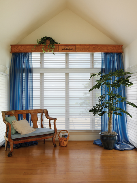
1. Treat them as accents, not themes
- Swap out heart motifs for solids, stripes, or abstract patterns.
- A red throw pillow or a blush vase feels like design, not a holiday leftover.
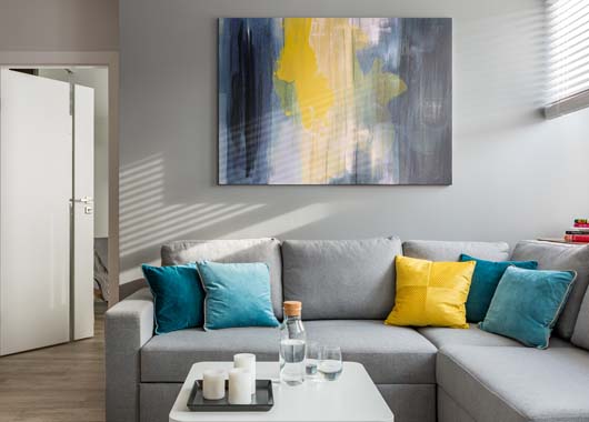
2. Lean into deeper, moodier tones
- Burgundy, wine, terracotta, dusty rose, mauve — these read as cozy and grown?up.
- They pair beautifully with neutrals like cream, camel, charcoal, or walnut wood.
3. Use them in natural materials
- Pink marble, red clay pottery, rose?tinted glass, or textiles like linen and wool feel timeless.
4. Pair them with grounding colors
Here are combos that instantly break the Valentine’s vibe:
| Red/Pink Shade | Pair With | Why It Works |
|---|---|---|
| Blush pink | Olive green | Earthy + soft contrast |
| Deep red | Navy | Classic, bold, not romantic |
| Coral pink | Teal | Fresh and modern |
| Rose | Warm beige | Calm, cozy, neutral |
| Brick red | Charcoal | Dramatic and contemporary |
5. Mix textures instead of symbols
Velvet, boucle, matte ceramics, woven baskets — texture adds depth and makes the palette feel intentional.
6. Bring in florals that aren’t roses
- Ranunculus, tulips, eucalyptus, or dried grasses
- They keep the color palette but ditch the Valentine’s symbolism.
A few style directions that use red/pink beautifully
- Mid?century modern: red accents with walnut wood
- Boho: dusty pink textiles with terracotta
- Minimalist: one bold red statement piece in an otherwise neutral room
- Scandinavian: soft blush paired with light woods and white